Graph of company's share price over the last 5 years, also showing dividend payments and trading profit. Left graph shows data over early 4 years. Right graph shows expanded time scale for latest 12 months. Typically more recent information is of greater concern for investors, but earlier information may also be of interest.
Graph show normalised dividend payments (if any) per share. Normalised over 12 months to smooth out variations between Interim and Final (and any quarter-year) dividend payments. Comparing height of normalised dividends with share price gives visual indication of dividend yield: the higher the better for investors.
Any special dividend is shown separately as a narrow bar above the normalised dividend. Special dividends are not included in the calculation of normalised dividend.
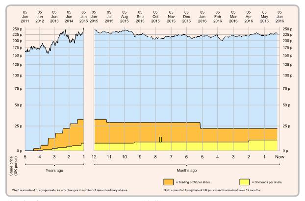
Graph also shows normalised trading profit per share. Normalised over 12 months to smooth out any variation over the year, Trading profit indicates the company's ability to generate profit from normal trading activities, before any exceptional charges or non-trading activity (such as profit/loss from sale of assets or businesses).
Comparing height of trading profit with share price gives visual indication of underlying earnings yield: the higher the better for investors.
Trading profit should be significantly greater than dividend payments indicating the company's underlying ability to pay its dividends. Trading profit will not be visible on the graph if there is a trading loss or where profit is less than normalised dividend.